
AgileAnalytics:measurewhereyoursoftwaredeliverystalls
Ask an engineering team where the time goes and you rarely get the answer the data gives. Build times are on every dashboard. Waiting on a review, a handover between teams, an environment that is occupied — that appears nowhere. That is where most of the loss sits, and it is exactly what the screens you already have cannot show you.
This is what Agile Analytics looks like
Seven screens from the application itself. Click a screen to view it full size, on desktop and on mobile.
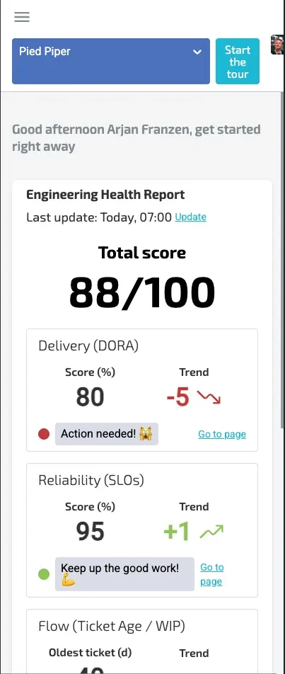
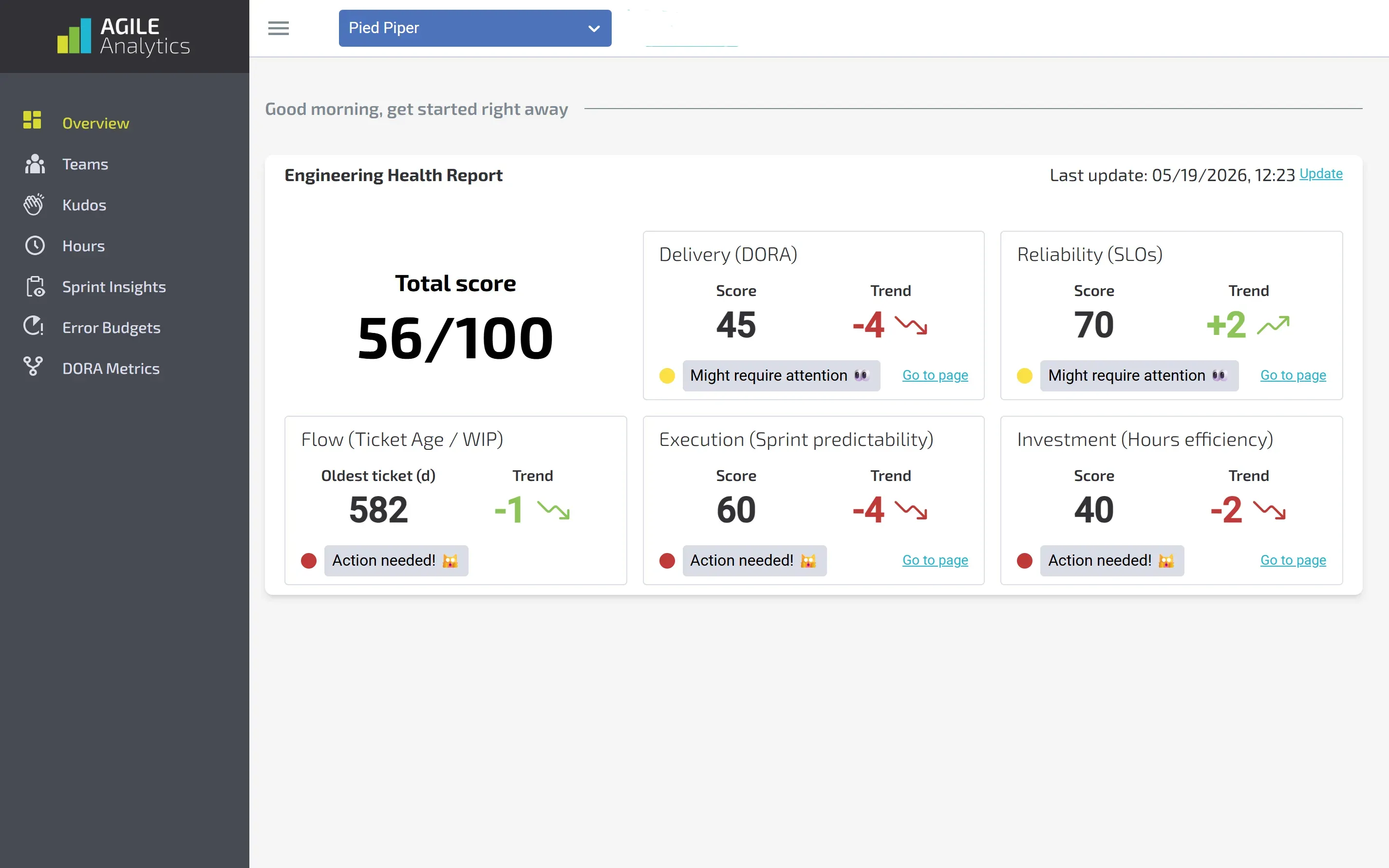
Engineering Health Report
One number for the health of your engineering, built from five scores: delivery, reliability, flow, predictability and hours. One glance shows you where it hurts and which way it is moving.
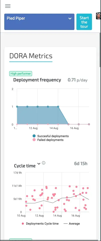
DORA metrics per repository
Deployment frequency, cycle time, time to restore and change failure rate, filterable per repository. The badges show whether you are performing at high or elite level.
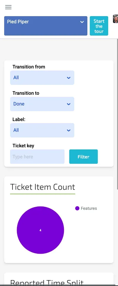
Sprint insights
Every status transition of every ticket, with timestamp, type, assignee and a confidence score. It shows where tickets get stuck instead of leaving you to guess.
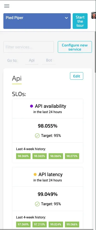
SLOs and error budget
Per service you see the current SLOs against their target and how much error budget is left, with deployments marked in the chart. So you know whether there is room left to release.
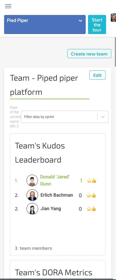
Team overview
Everything for one team on a single page: kudos, DORA figures, SLOs and error budget, filterable by the current sprint. Usable in a standup without opening seven tabs first.

Kudos
The praise team members give each other in their own channel, collected into a leaderboard and a who-thanked-whom overview. It shows how collaboration is going, not just how the numbers look.
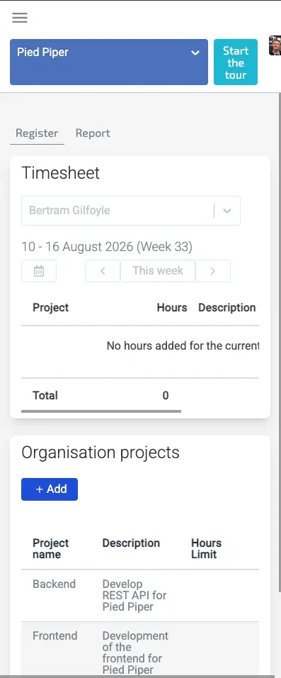
Time tracking
Log hours against organisation or personal projects, per week, right beside the numbers they feed. That turns hours efficiency into a score in the health report instead of separate admin.
Threelensesononeflow
Agile Analytics reads Git, CI/CD and Jira, and adds team surveys and interviews on top. That produces three lenses. AgileEx looks at the workflow: where work sits still, and for how long. DevEx looks at the human side: where developers get stuck, where attention leaks away. OpsEx looks at the reliability of the system underneath.
DORA and SPACE are in there, with SLOs and error budgets. Not as loose numbers on a dashboard, but side by side, so you can see how they relate.
Theanswerisrarelytheoneexpected
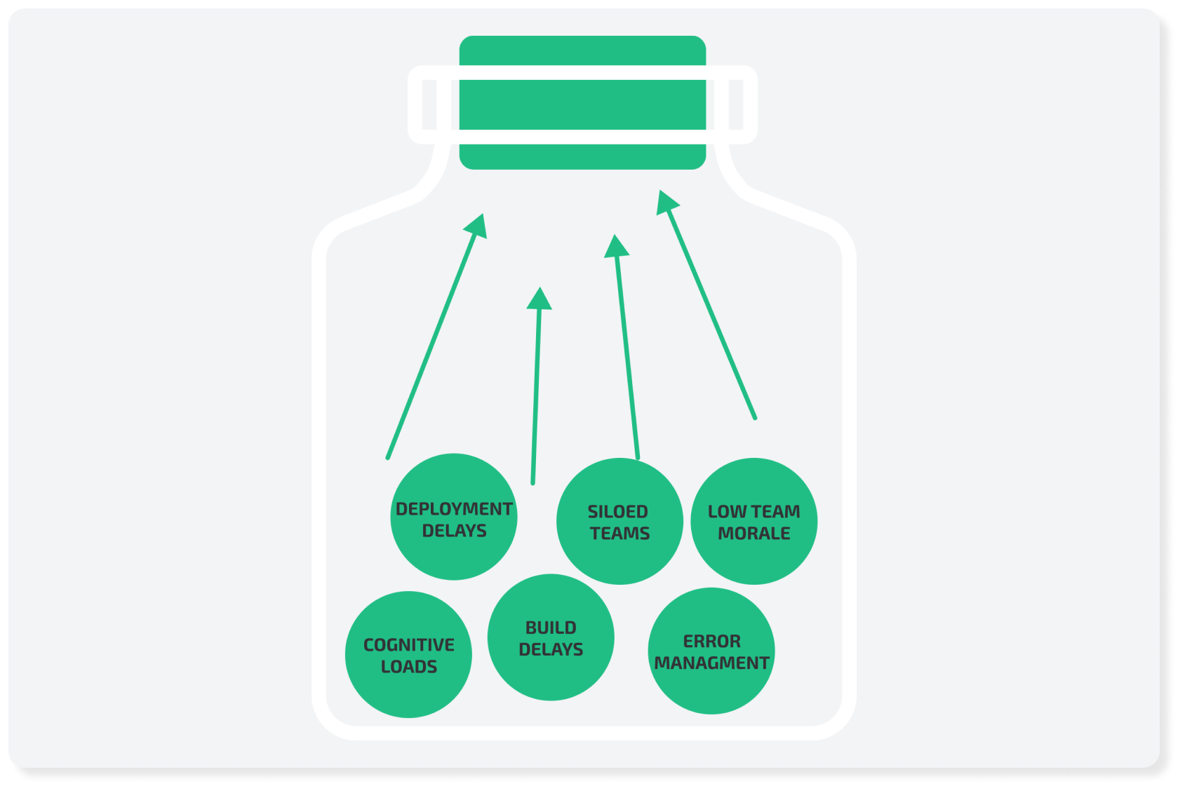
Jeroen Bultje of Maxeda, on what the measurement showed them: "We thought our bottleneck was deployment speed. It turned out to be handovers."
That is the kind of conclusion a team can spend months optimising the wrong side of. Deploying faster would have made no difference there at all.
Frommeasuringtosteering
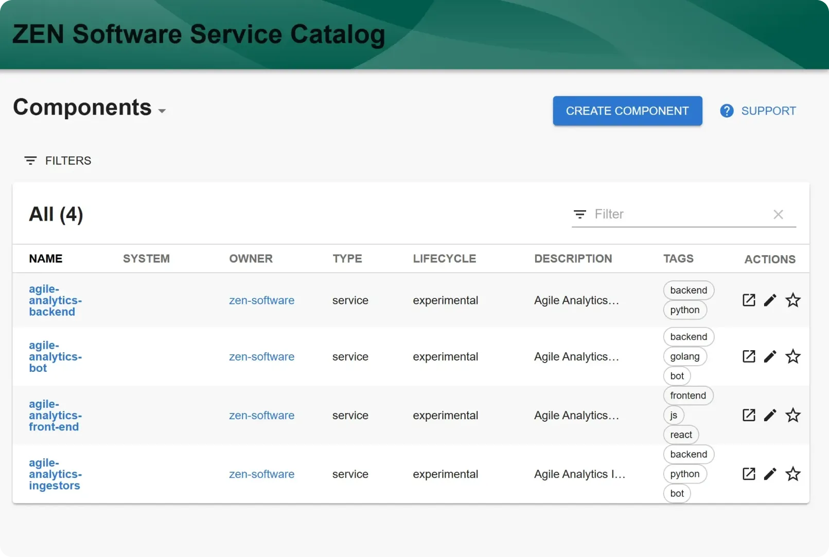
Measuring is one thing, acting on it another. That is why Agile Analytics sits alongside a developer portal: one place where documentation, tooling, APIs and team data come together. It saves the hunting that currently disappears into Slack threads, and it shortens onboarding for new developers, because project settings and resources are simply there.
Management and development then look at the same data. That sounds obvious, but it is precisely what most organisations lack: one steers on reports, the other knows how it actually runs.
Whatitdelivers
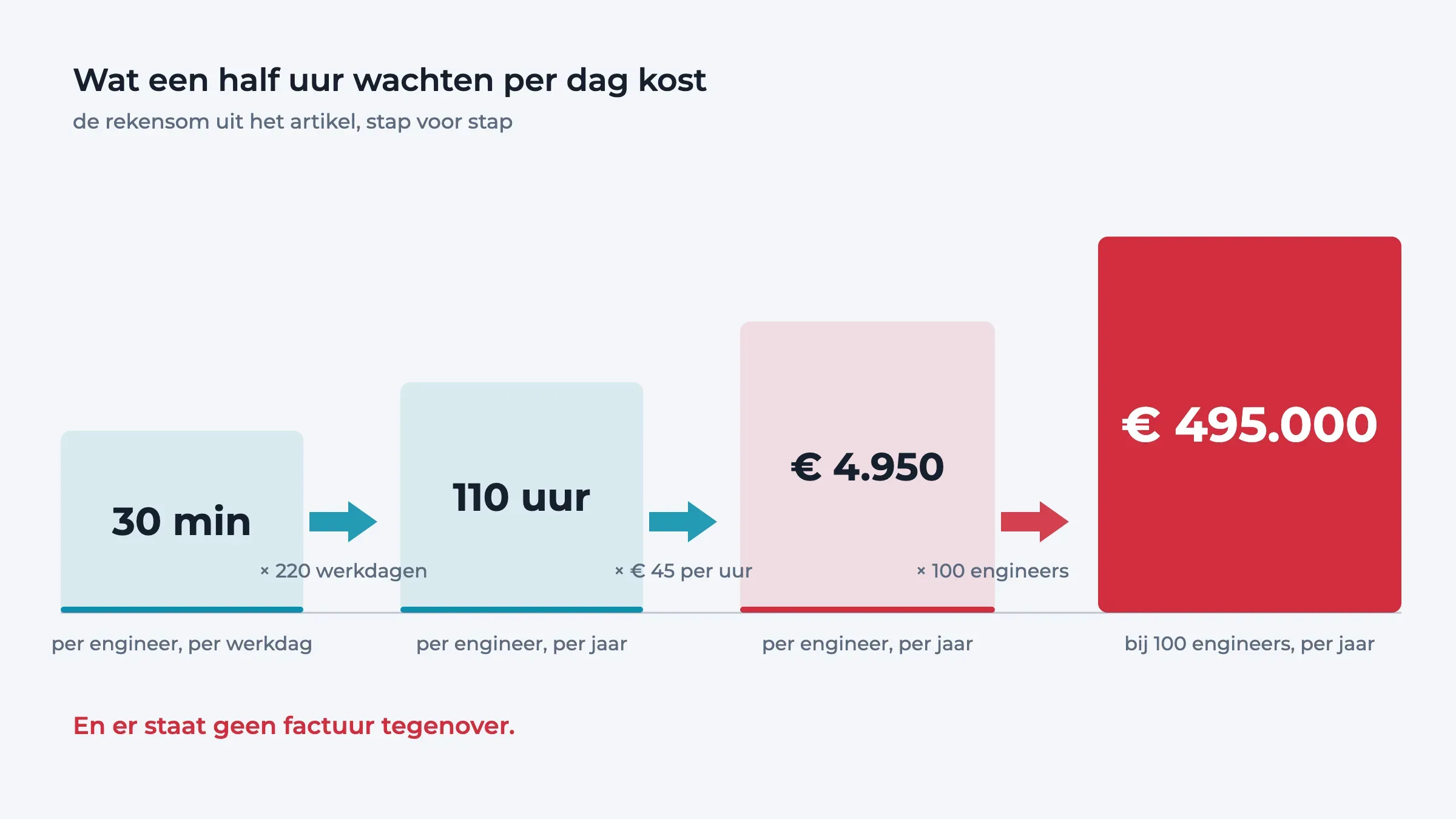
Agile Analytics reports lead times coming down by 30 to 60 per cent and 20 to 40 per cent fewer failed deployments. The arithmetic underneath is simple: thirty minutes of waiting per engineer per day works out at roughly €5,000 per engineer per year. At a hundred engineers that reaches half a million — a figure that appears on no invoice.
Connectingtowhatyouhave
It connects through Git, GitHub, GitLab or Azure DevOps, your CI/CD pipeline and Jira. No migration, no new way of working that has to be rolled out first. The first insight arrives within two weeks.
Related News & Articles



Happy Nerds are productive Nerds
Implement DevOps and SRE super fast with Agile Analytics. Ask our Agile Nerds.