
Projectreinforcement:seniorengineersworkinginsideyourteam
A team that has stalled rarely lacks hands. It lacks someone who dares to point at the architecture, who knows why the pipeline falls over every Friday, and who fixes that without taking six months over it.
Yougetacolleague,notaresource
Our engineers work inside your team, on your processes, in your repo. No separate workstream alongside the team, no reporting line running around it. They take responsibility for what they deliver from day one — including the review, the tests and whatever breaks afterwards.
We are a small studio in Alkmaar and have worked this way since 2015, for clients including Rabobank, ANWB and Booking.com. Whoever joins you is senior; there is no junior hidden behind the contract.
Measuringwhatisactuallywrong
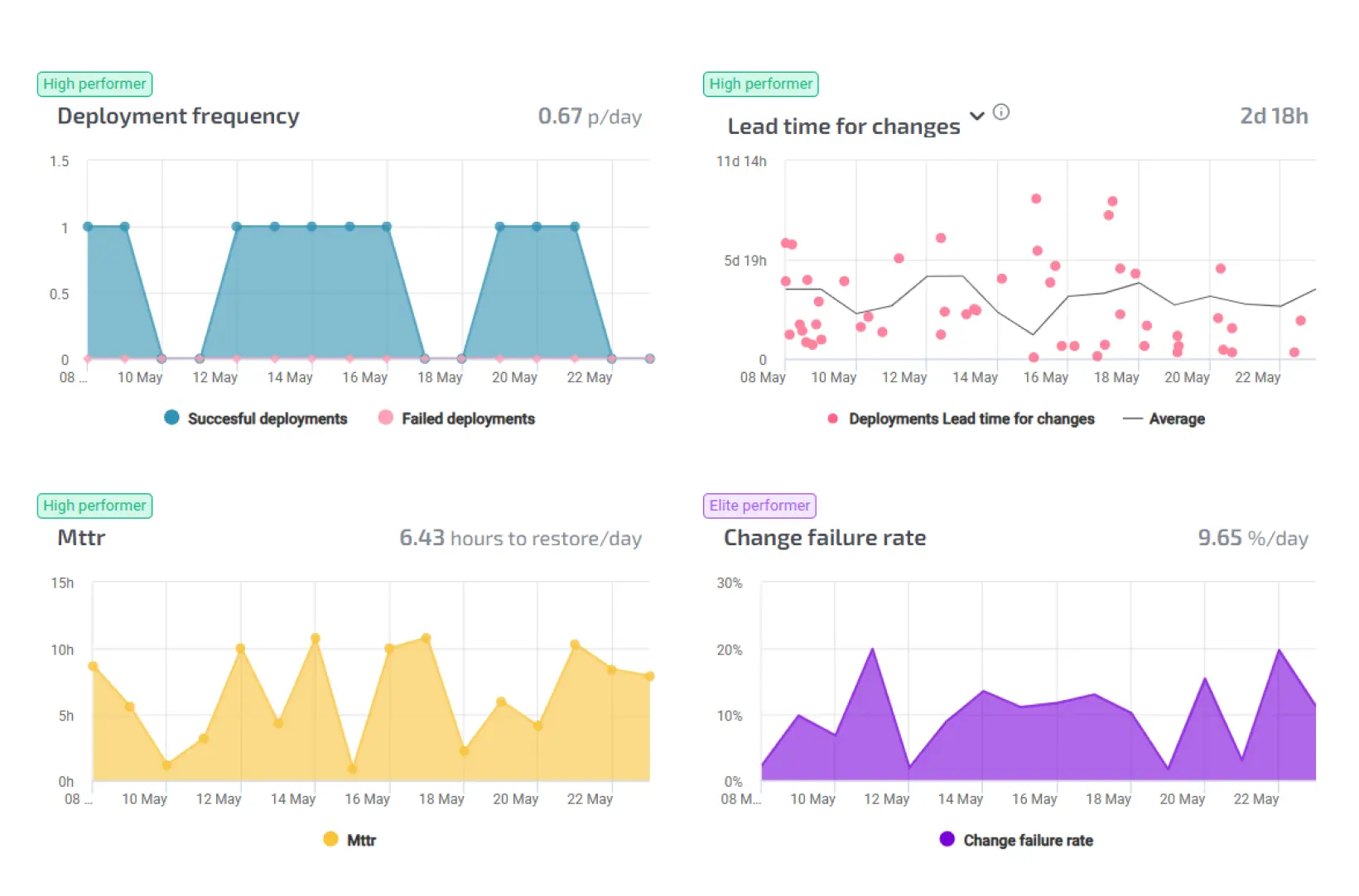
Before reinforcing a team, it helps to know where it is stuck. With Agile Analytics we make lead time visible: where work sits still, how long the wait for a review is, and where the pleasure of the job leaks away. DORA and SPACE as the framework, not gut feeling.
That sometimes produces an unwelcome answer. At Maxeda the bottleneck turned out not to be deployment speed but the handovers between teams — and extra capacity solves nothing there.
Supportwhereithurts
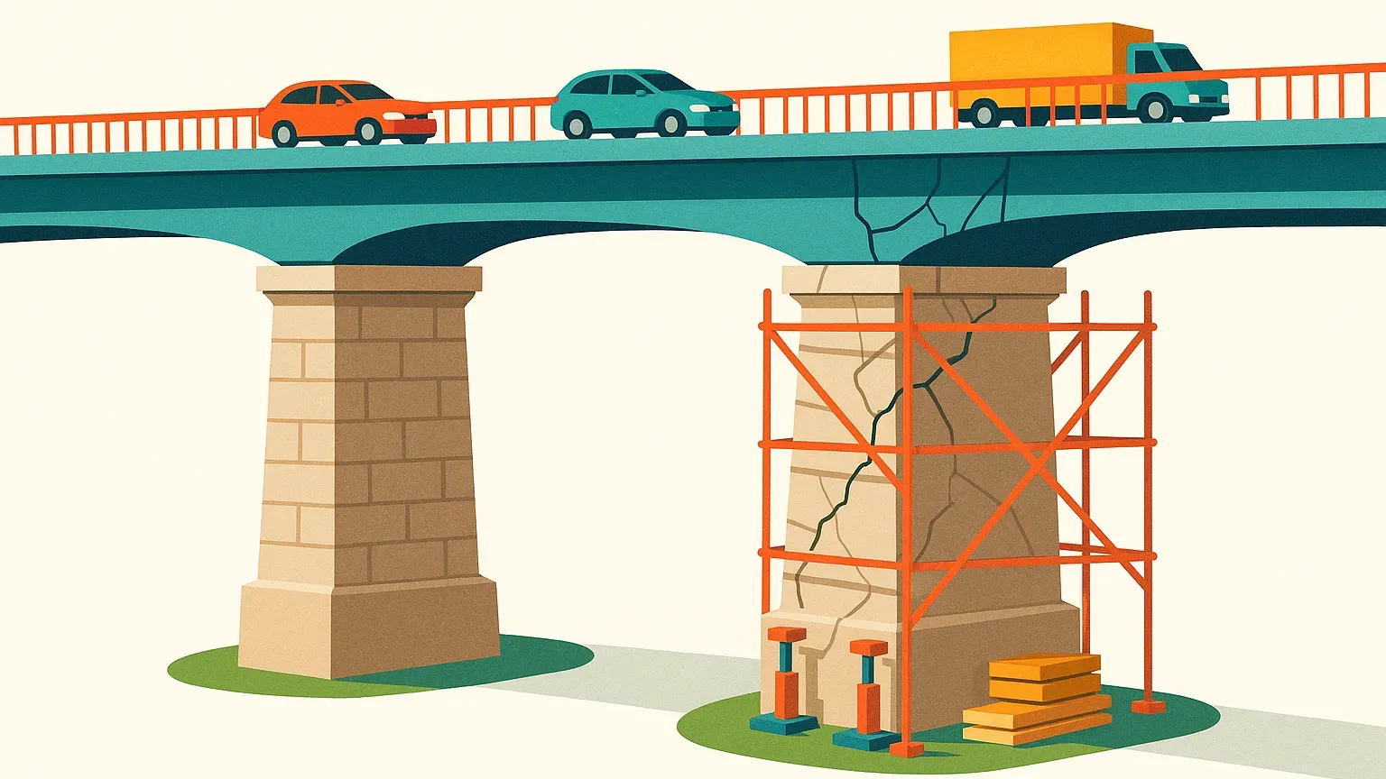
In practice the work often comes down to untangling the pipeline. We work daily with GitLab, GitHub, Bitbucket and Azure DevOps, and know the sharp edges of each. Going from a build that takes twenty minutes to one that takes four saves more per developer per day than an extra pair of hands.
Reinforcetemporarily,leaveitstructurallybetter
What separates us from an average contracting agency is what remains once we leave. We document what we build, we explain why, and we leave the team less dependent on us than when we arrived. That is not a side note — it is how you measure whether the engagement was worth anything.
Howitstarts
With a conversation about where it hurts. Then an engineer joining in, usually within two weeks. No tender process, no barrage of CVs.
Whatdoesprojectreinforcementcostperhour?
Senior cloud and platform engineers cost €130 to €165 per hour, excluding VAT, depending on role and commitment. No rate card, no tiers: we agree one rate up front for the engineer who joins you.
If the work is well defined, a fixed-price sprint is usually cheaper: €4,000, €8,000 or €12,000 for two weeks, with a sprint goal that is certain to be done.
Related News & Articles


What Agile Analytics looks like
A few screens from the product, as you see them in use.
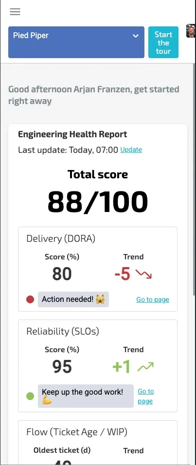
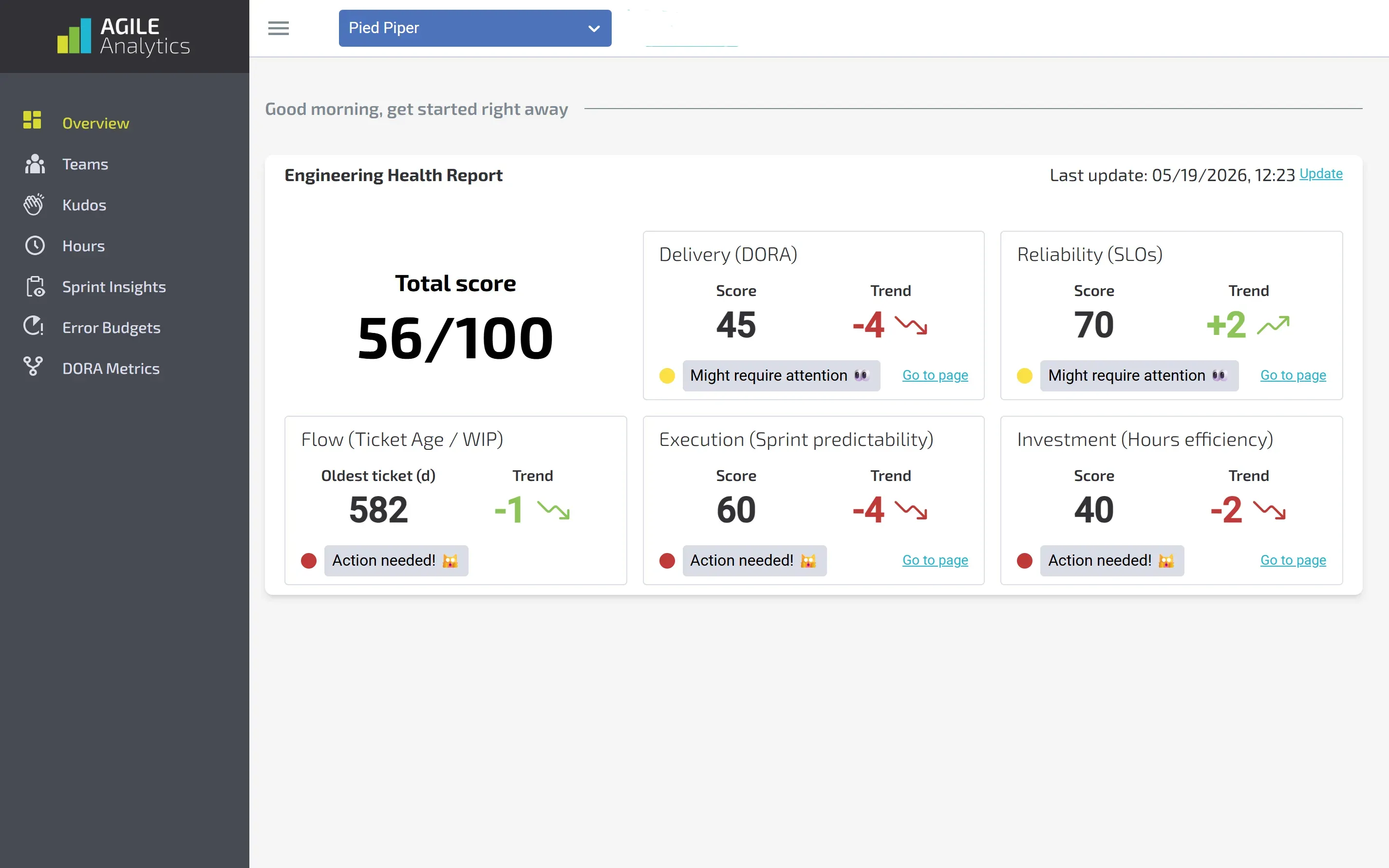
Engineering Health Report
One number for the health of your engineering, built from five scores: delivery, reliability, flow, predictability and hours. One glance shows you where it hurts and which way it is moving.
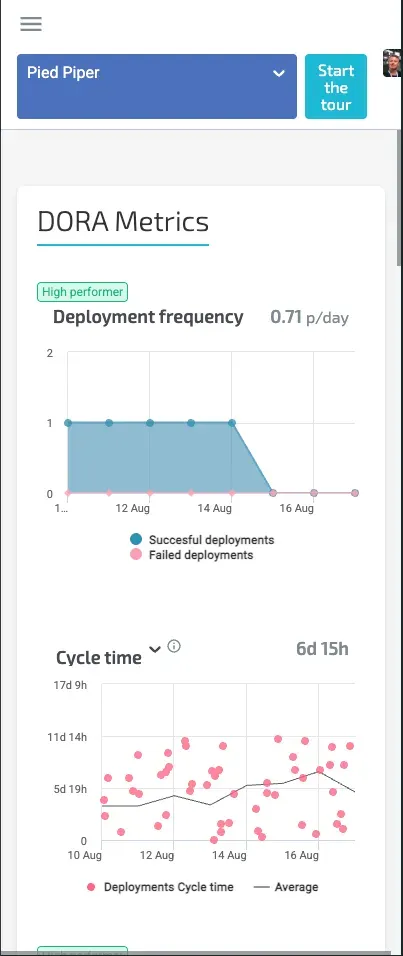
DORA metrics per repository
Deployment frequency, cycle time, time to restore and change failure rate, filterable per repository. The badges show whether you are performing at high or elite level.
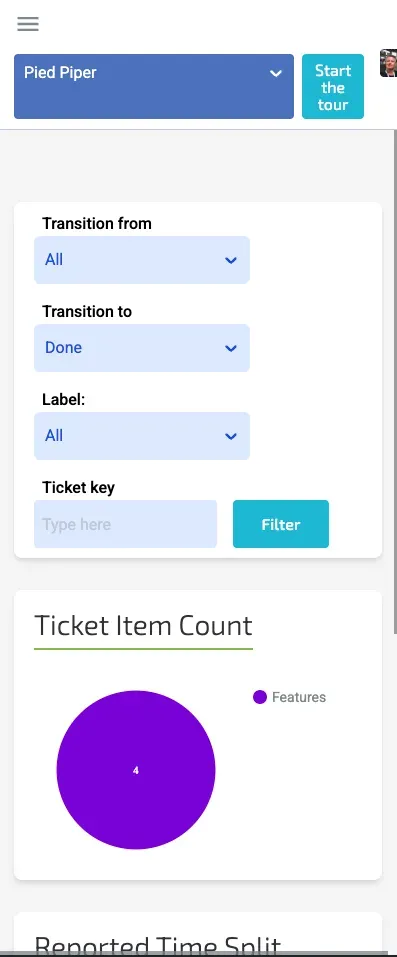
Sprint insights
Every status transition of every ticket, with timestamp, type, assignee and a confidence score. It shows where tickets get stuck instead of leaving you to guess.
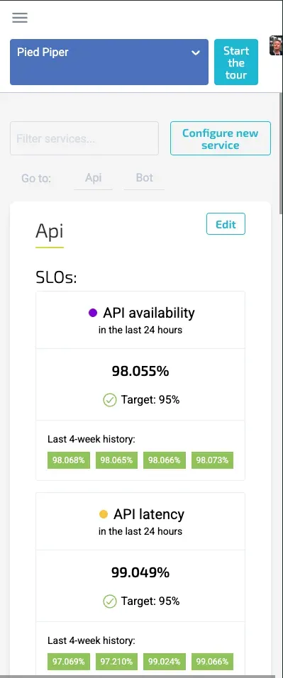
SLOs and error budget
Per service you see the current SLOs against their target and how much error budget is left, with deployments marked in the chart. So you know whether there is room left to release.
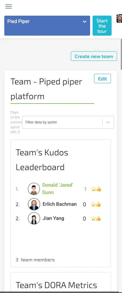
Team overview
Everything for one team on a single page: kudos, DORA figures, SLOs and error budget, filterable by the current sprint. Usable in a standup without opening seven tabs first.

Kudos
The praise team members give each other in their own channel, collected into a leaderboard and a who-thanked-whom overview. It shows how collaboration is going, not just how the numbers look.
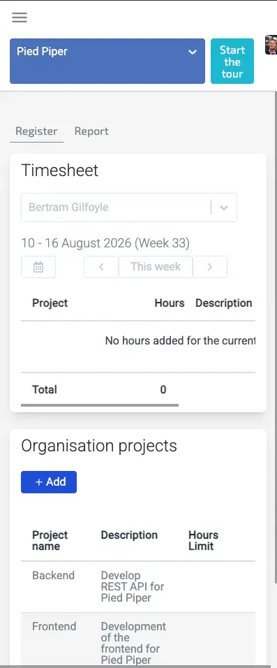
Time tracking
Log hours against organisation or personal projects, per week, right beside the numbers they feed. That turns hours efficiency into a score in the health report instead of separate admin.

We're confident we can supercharge your software operation
Our products and services will delight you.